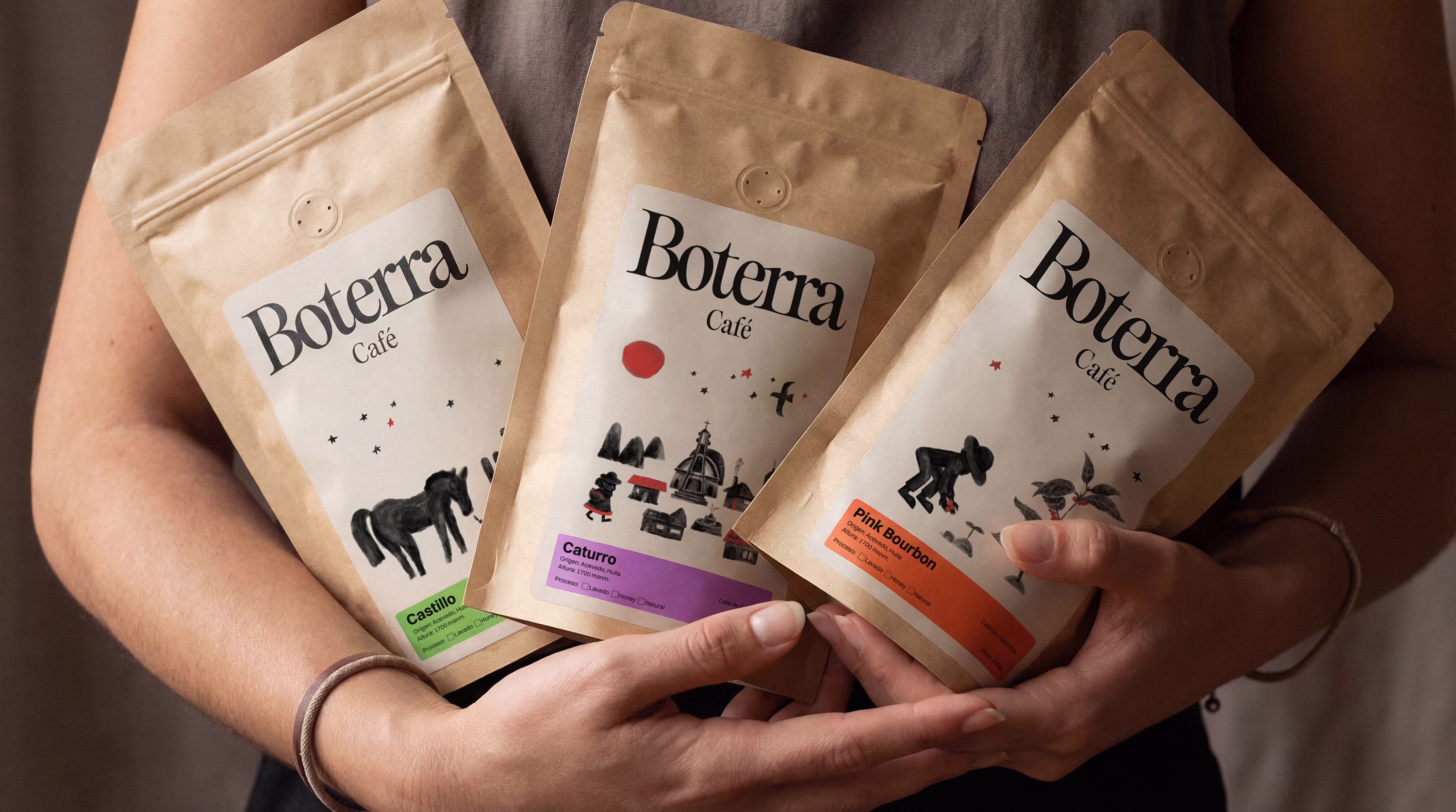
Context
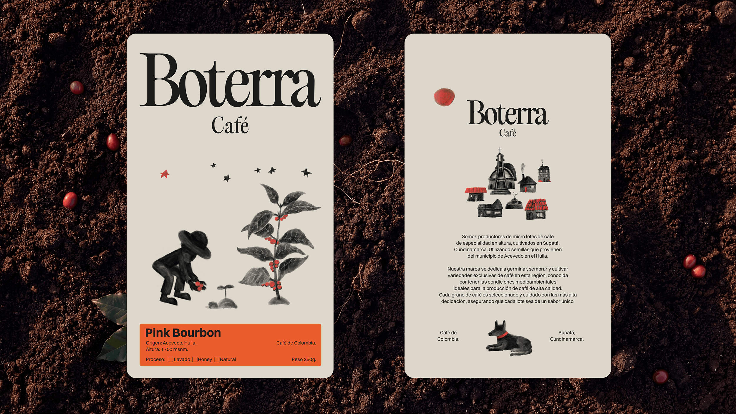
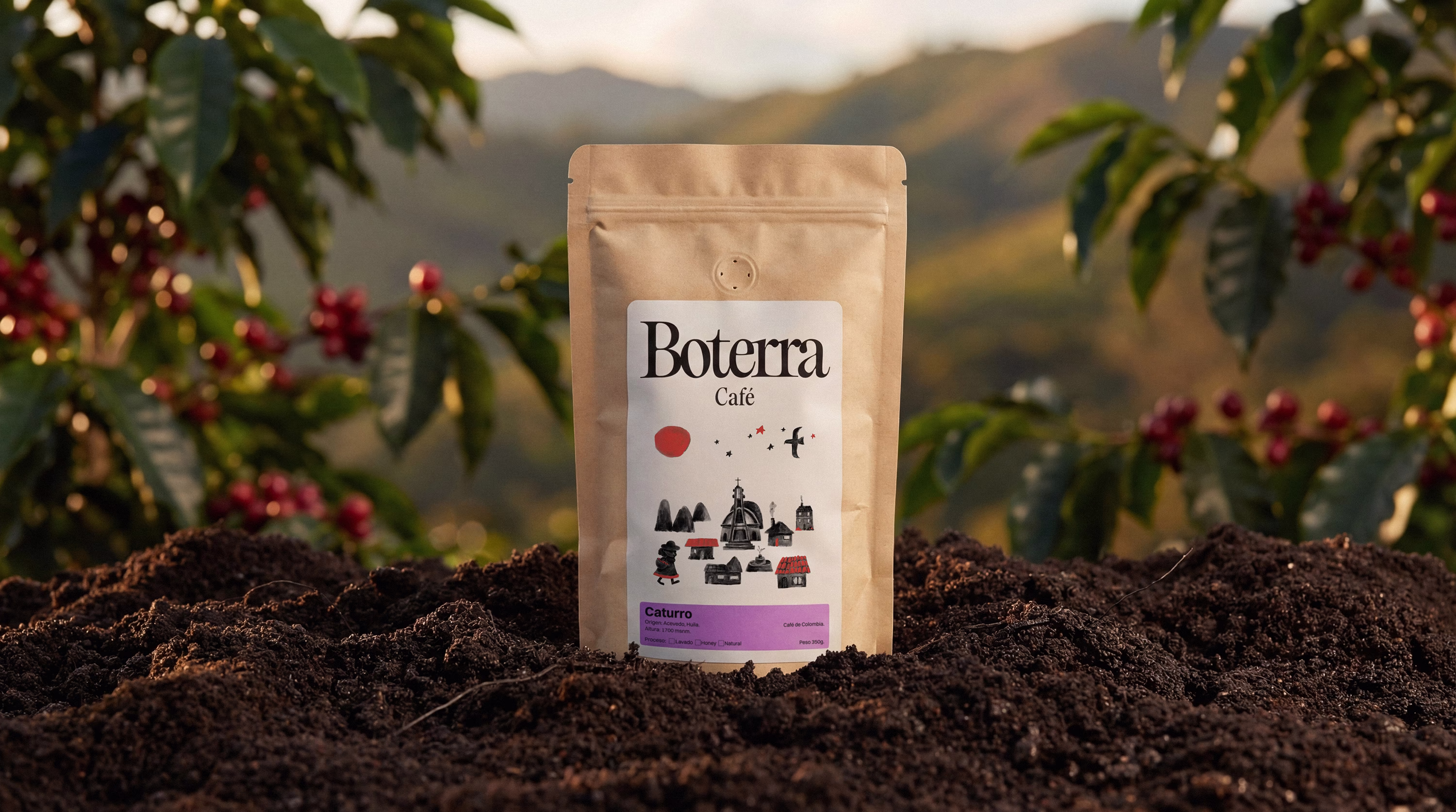
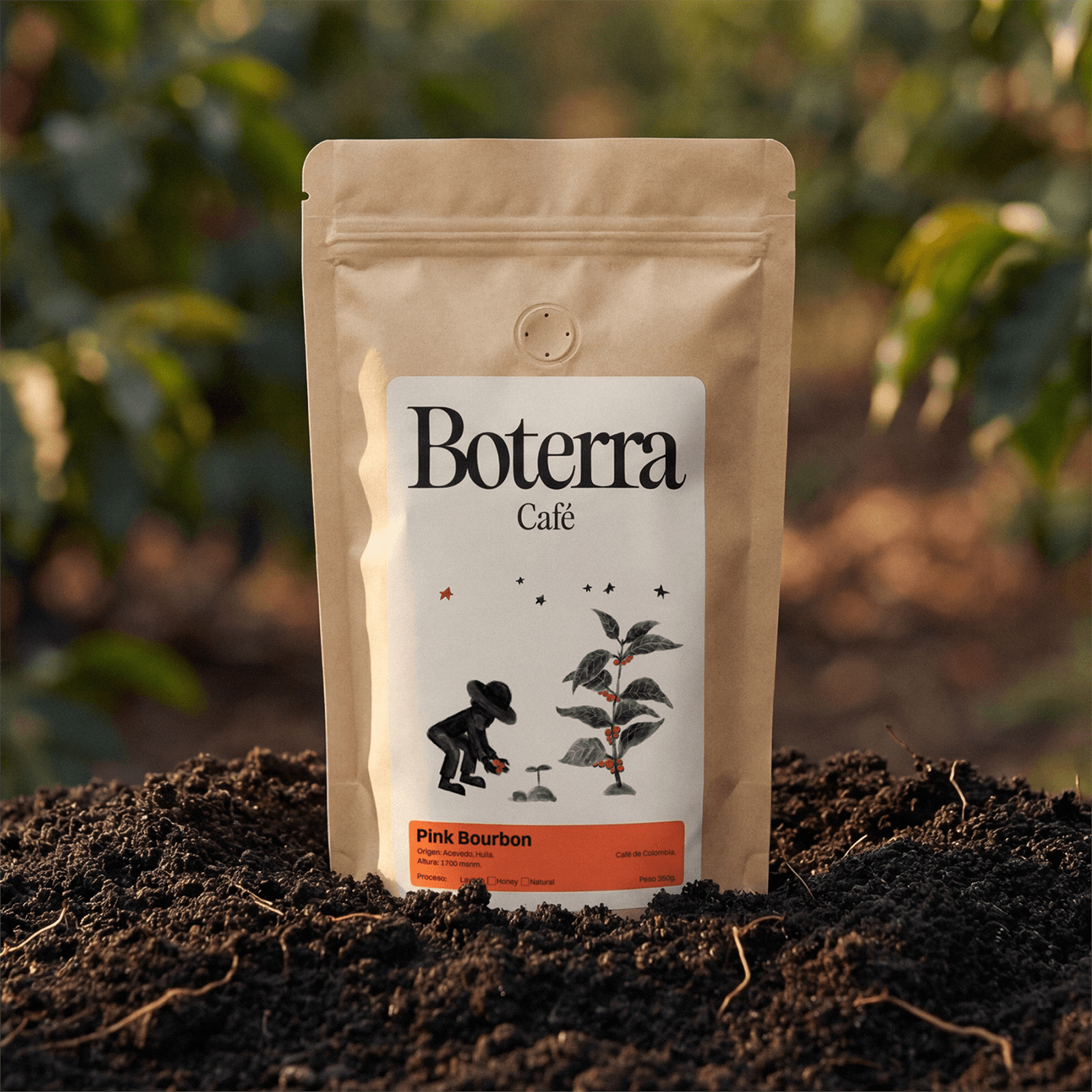
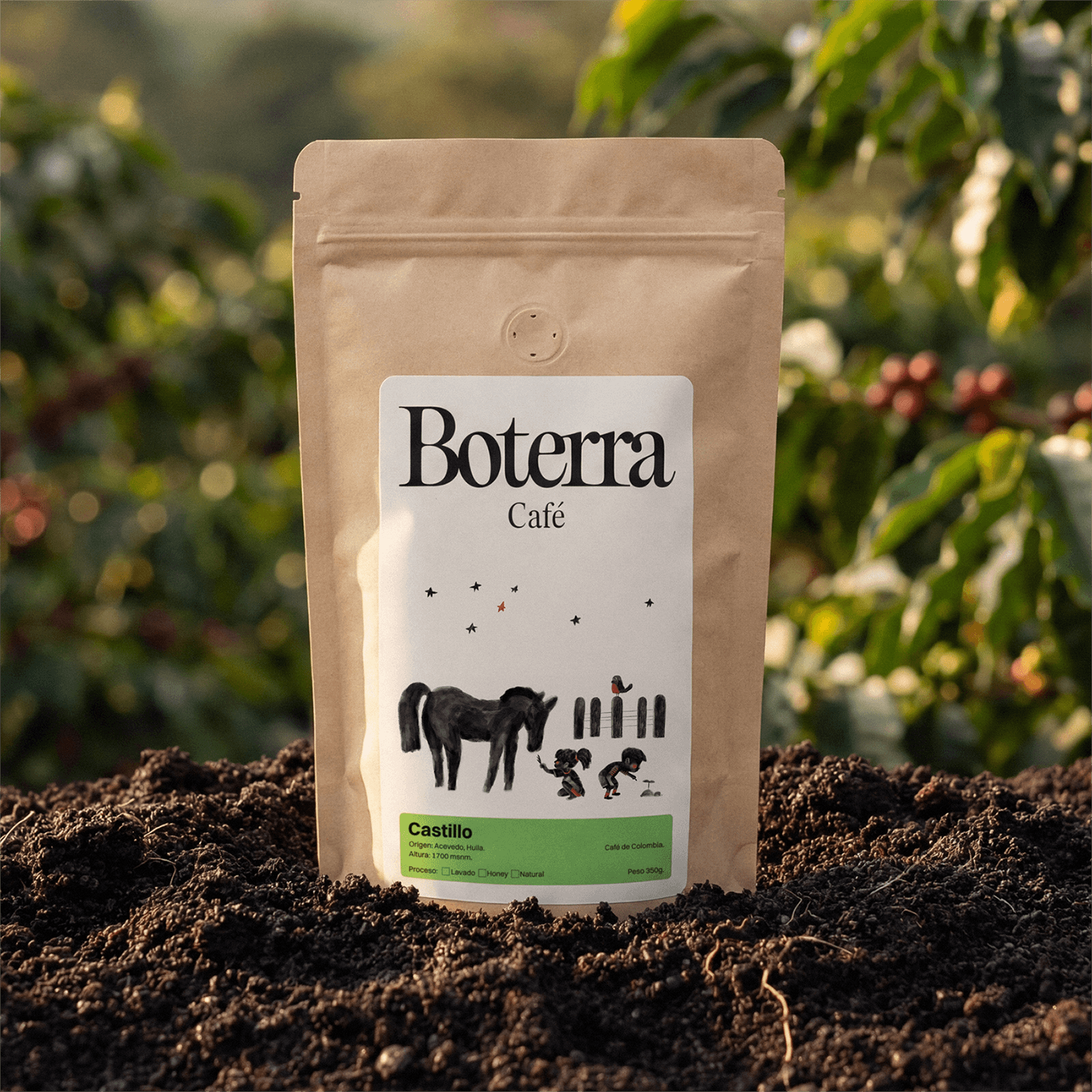
Produced in Supatá using seeds sourced from Acevedo, Huila, Boterra positions itself within the specialty segment through a proposal deeply rooted in place. Packaging became the primary point of contact between the consumer and the origin of the coffee.
The challenge
The system needed to represent territory and craft while avoiding folkloric codes or generic premium coffee aesthetics.
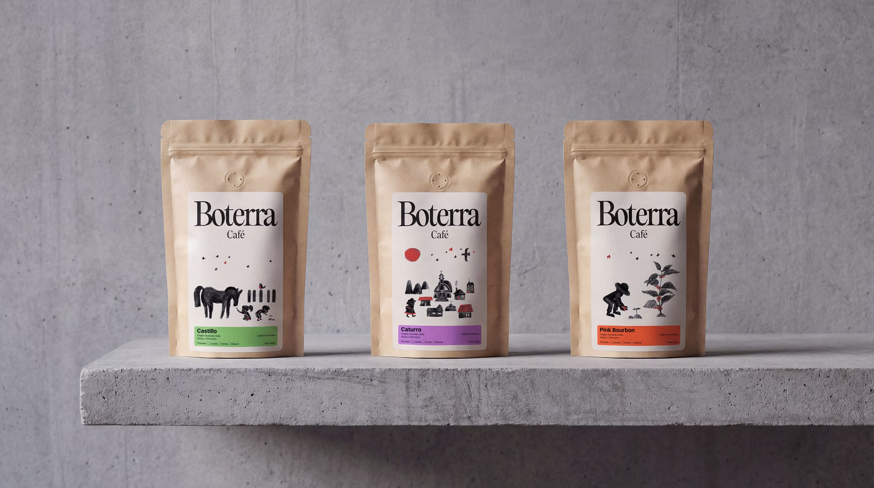
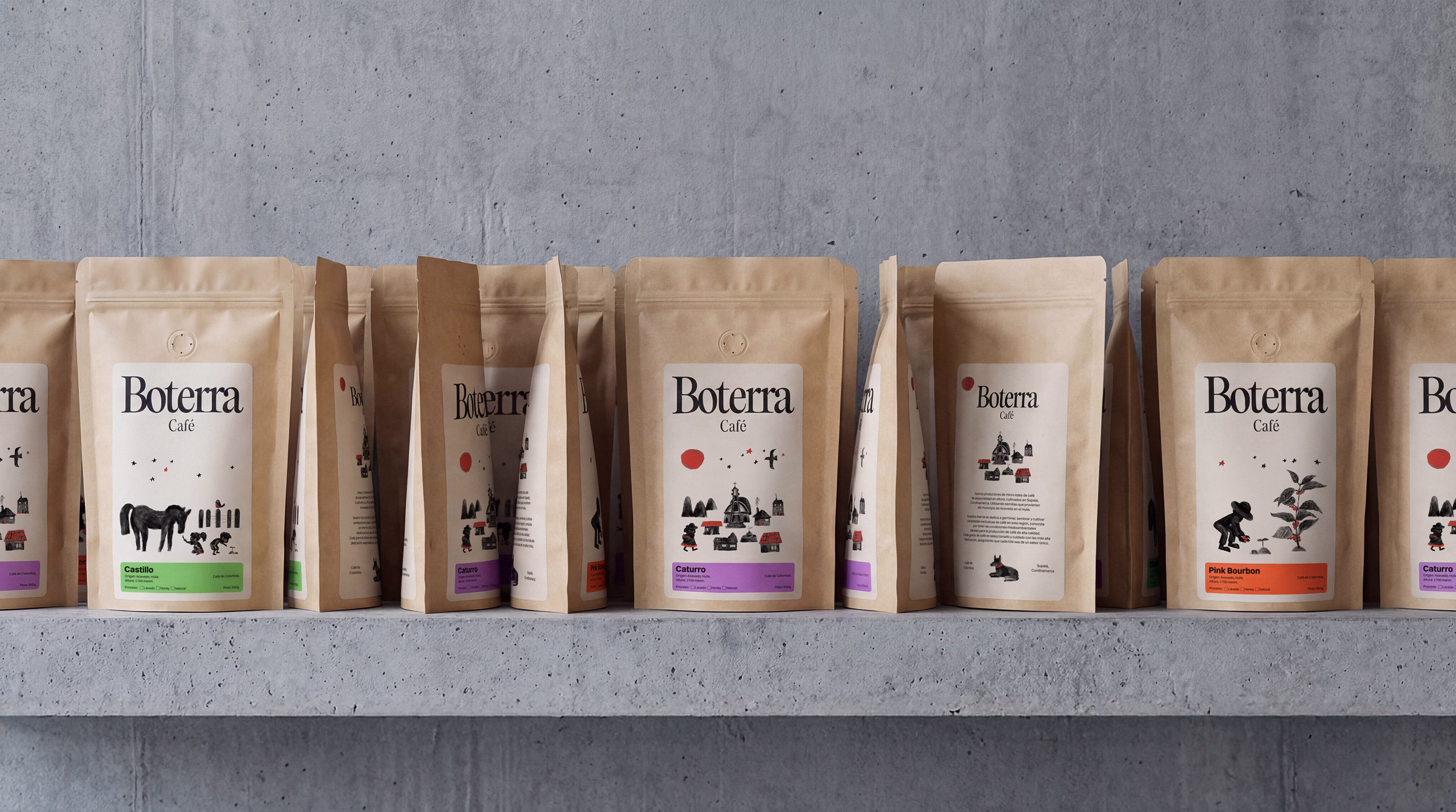
At the same time, it had to allow differentiation between microlots while maintaining structural consistency and room for future growth.
The approach
A sober, editorial packaging architecture was designed to organize information with clarity and establish a stable foundation for the system.
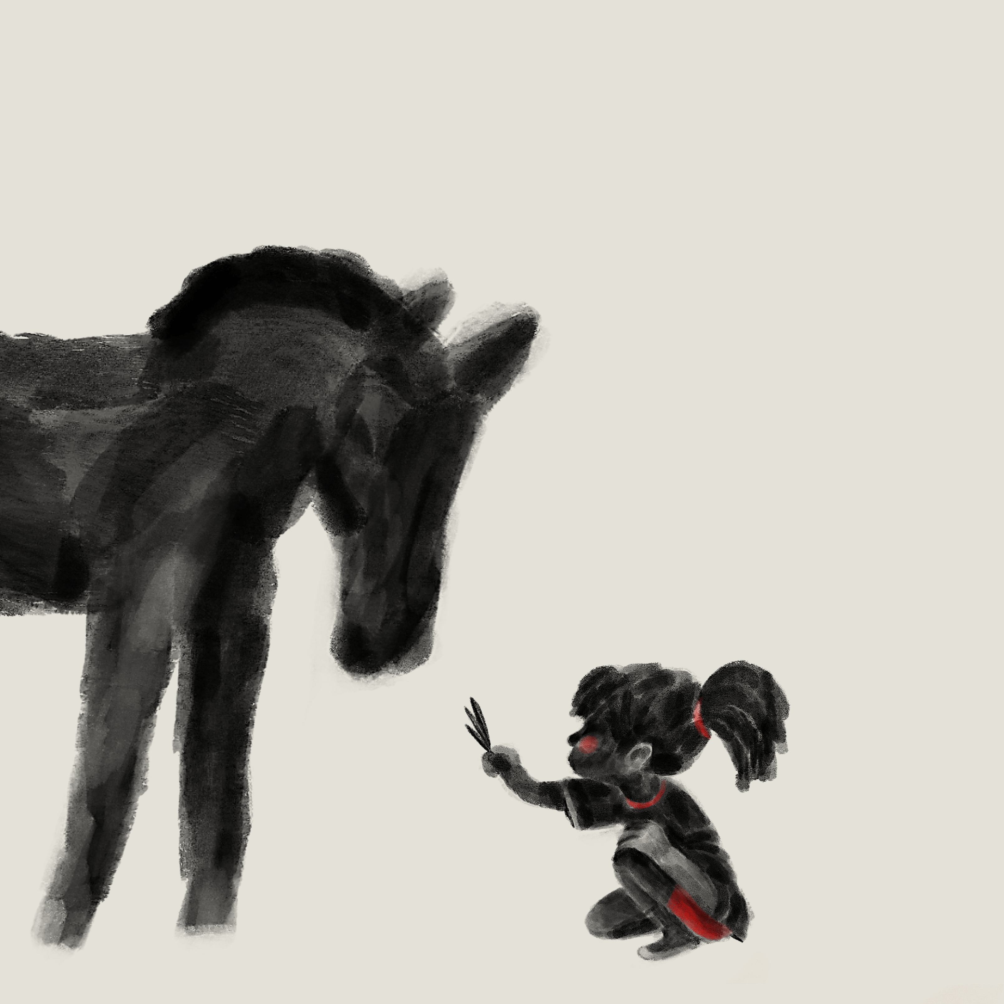
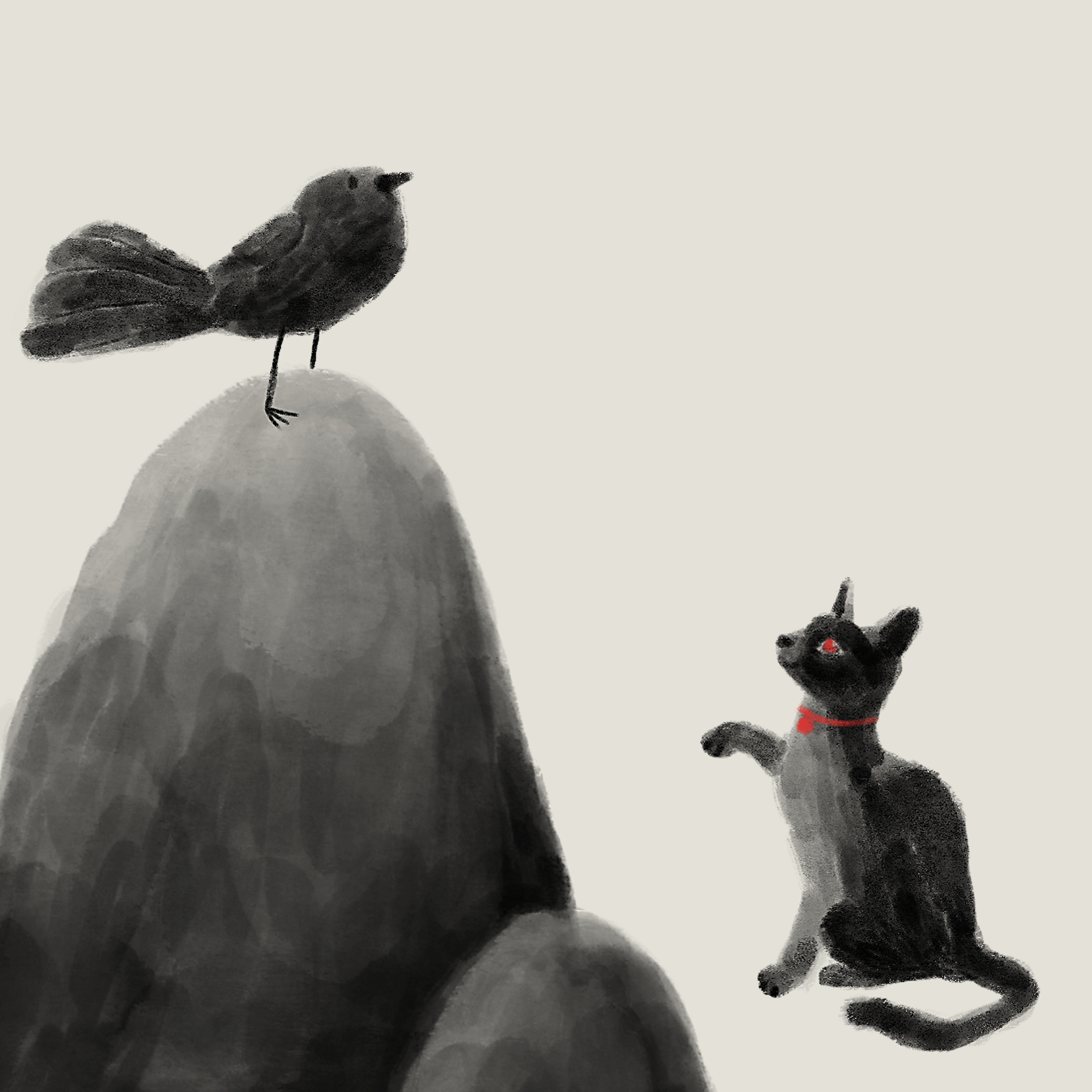
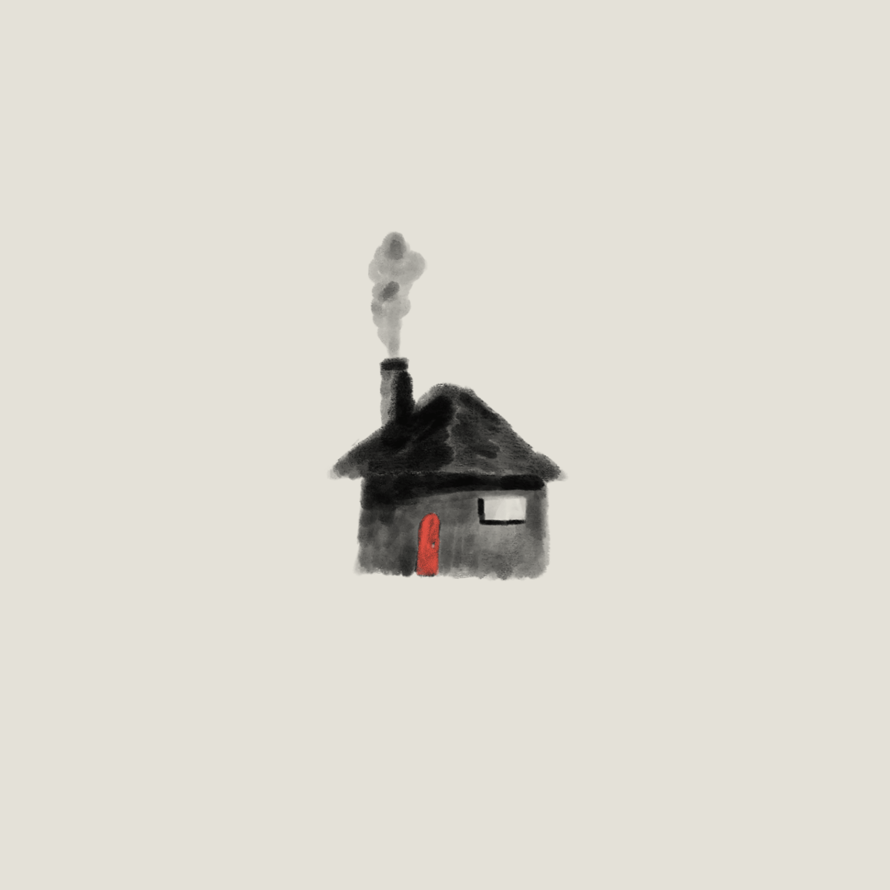
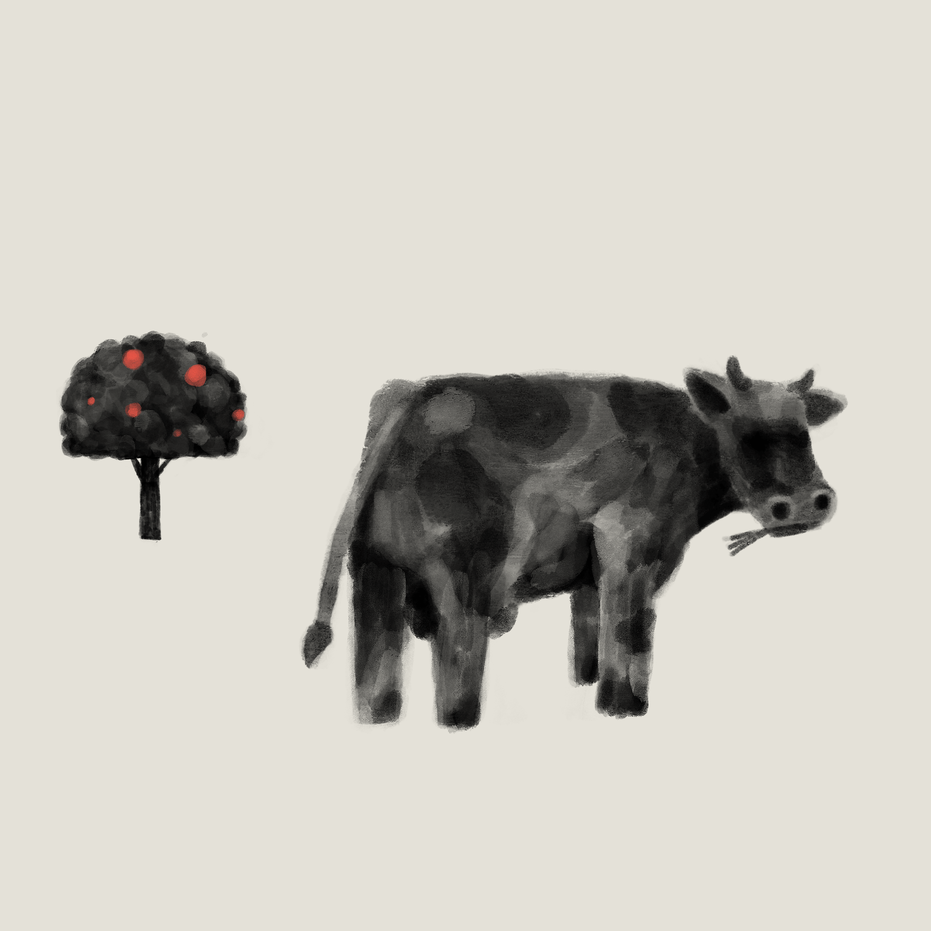
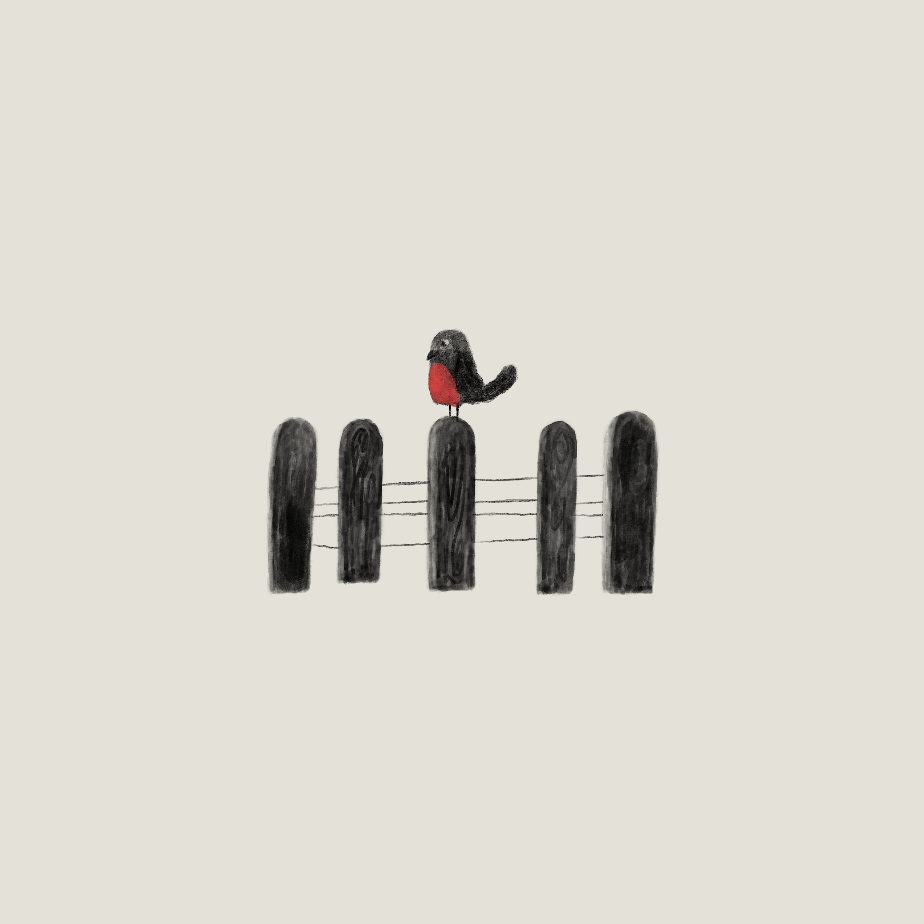
On top of this structure, an illustrated language was developed as a graphic evocation of the dark soil where the coffee is cultivated. Through dense linework, the illustrations suggest texture and depth without depicting the landscape literally.
Color reinforces this narrative. Deep black references the fertile soil that sustains the crop, while a vibrant red accent signals the moment of optimal ripeness within a predominantly monochromatic system.
This logic allows the packaging to operate as a modular structure: the architecture remains stable while the illustrated universe expands across new editions.
Outcome
The result is a packaging system where origin becomes visual structure. Soil and fruit articulate a distinctive graphic language prepared to grow alongside the brand while preserving coherence and recognizability.