Context
Colombo operates across three distinct production areas: advertising, film, and branded content. Each discipline has its own language and production logic, yet all needed to live under a unified brand identity.
The redesign focused on creating a visual structure capable of articulating these services while maintaining clarity and cohesion.
The challenge
To represent three distinct units without fragmenting the brand.
The identity needed to organize the services through a simple and scalable system that could adapt across different formats and communication contexts.
The approach
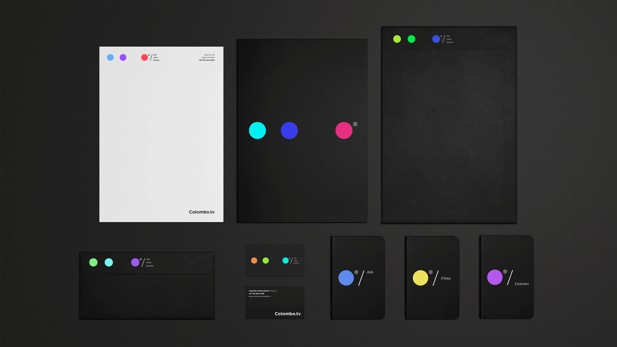
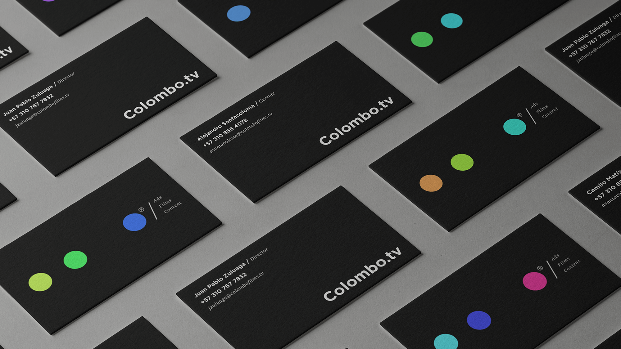
The logo was conceived as a modular structure informed by the relationship between the three services. Rather than functioning as separate labels, the system organizes the brand through a formal logic where elements interact within a shared framework.
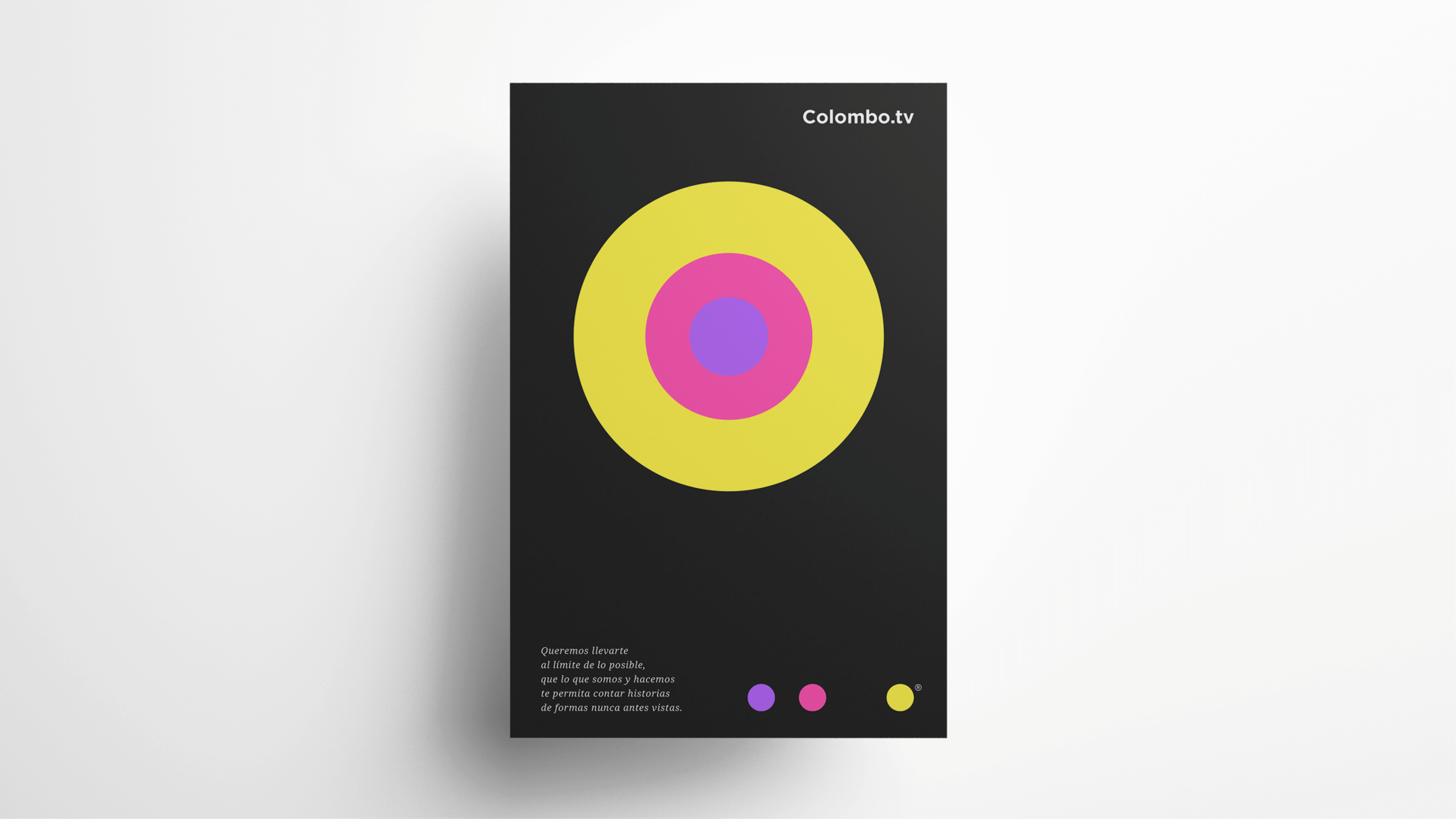
Color operates as a dynamic spectrum that moves across the brand depending on the service and application. Each expression selects a moment within this chromatic range, allowing variation while maintaining visual coherence.
Together, structure and color define a flexible identity capable of expanding across the studio’s different production areas.
Outcome
The result is a visual identity that organizes Ads, Film, and Content within a single brand architecture.
The system provides a clear and adaptable foundation that allows Colombo to communicate across different media while maintaining unity and distinction.