Context
The wellness category often relies on highly clinical or overly solemn visual codes. Sketos required an identity that felt approachable, clear, and distinctive while supporting the expansion of a new product line.
The design needed to communicate personal development in a way that felt human, simple, and recognizable.
The challenge
To design a packaging system capable of communicating self-care in a clear and scalable way.
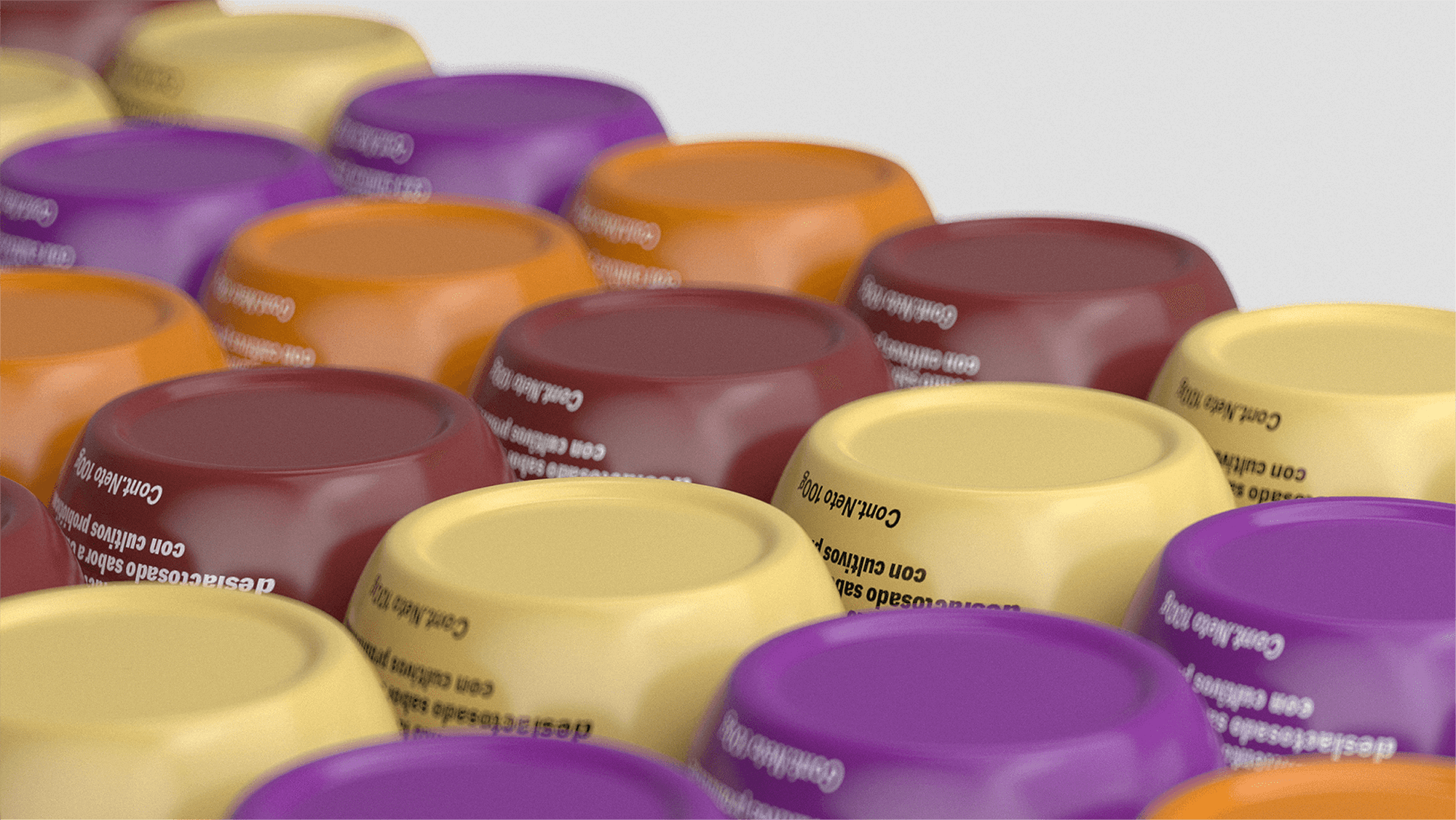
The system needed to sustain a growing range of products while maintaining a strong and coherent visual identity.
The approach
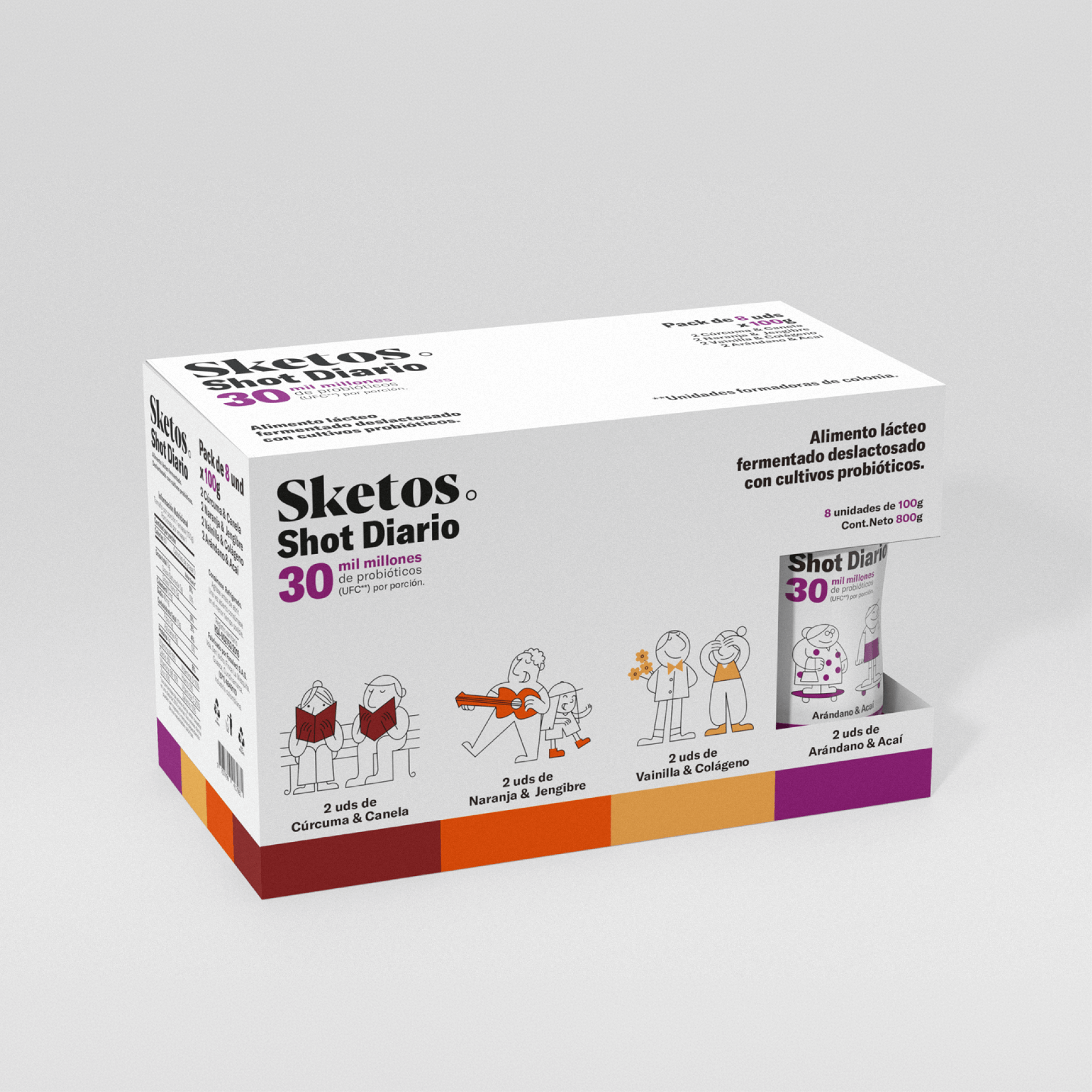
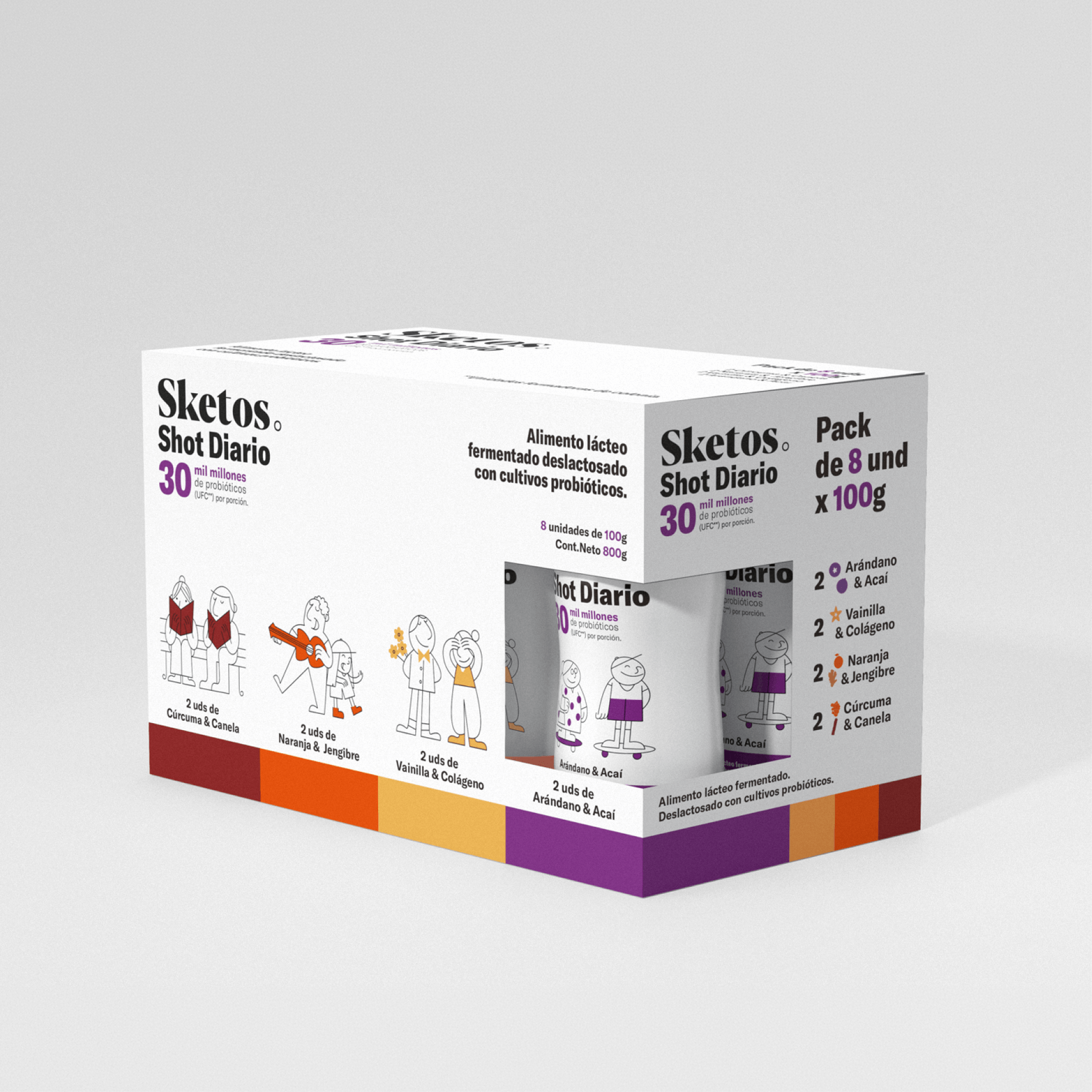
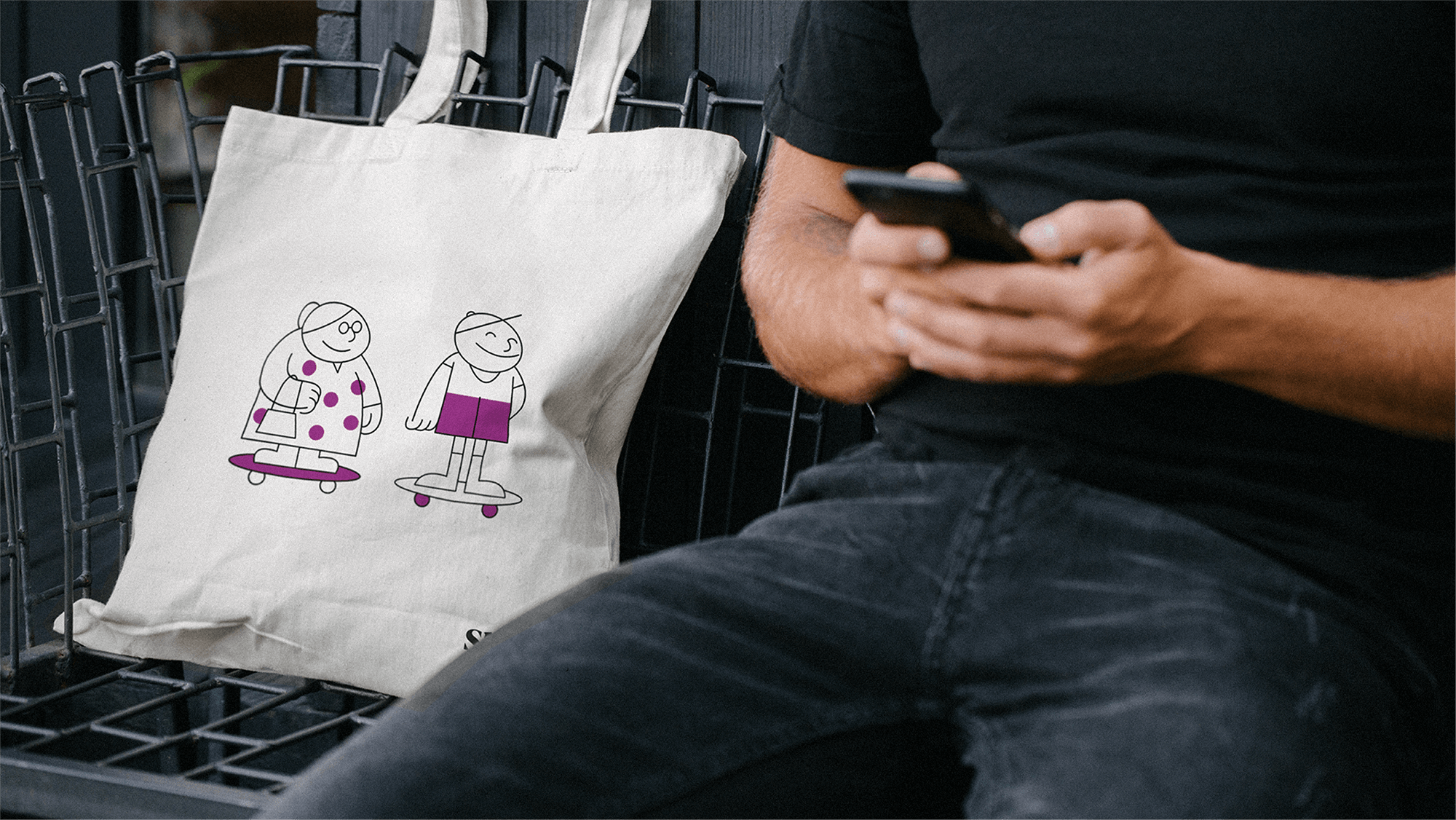
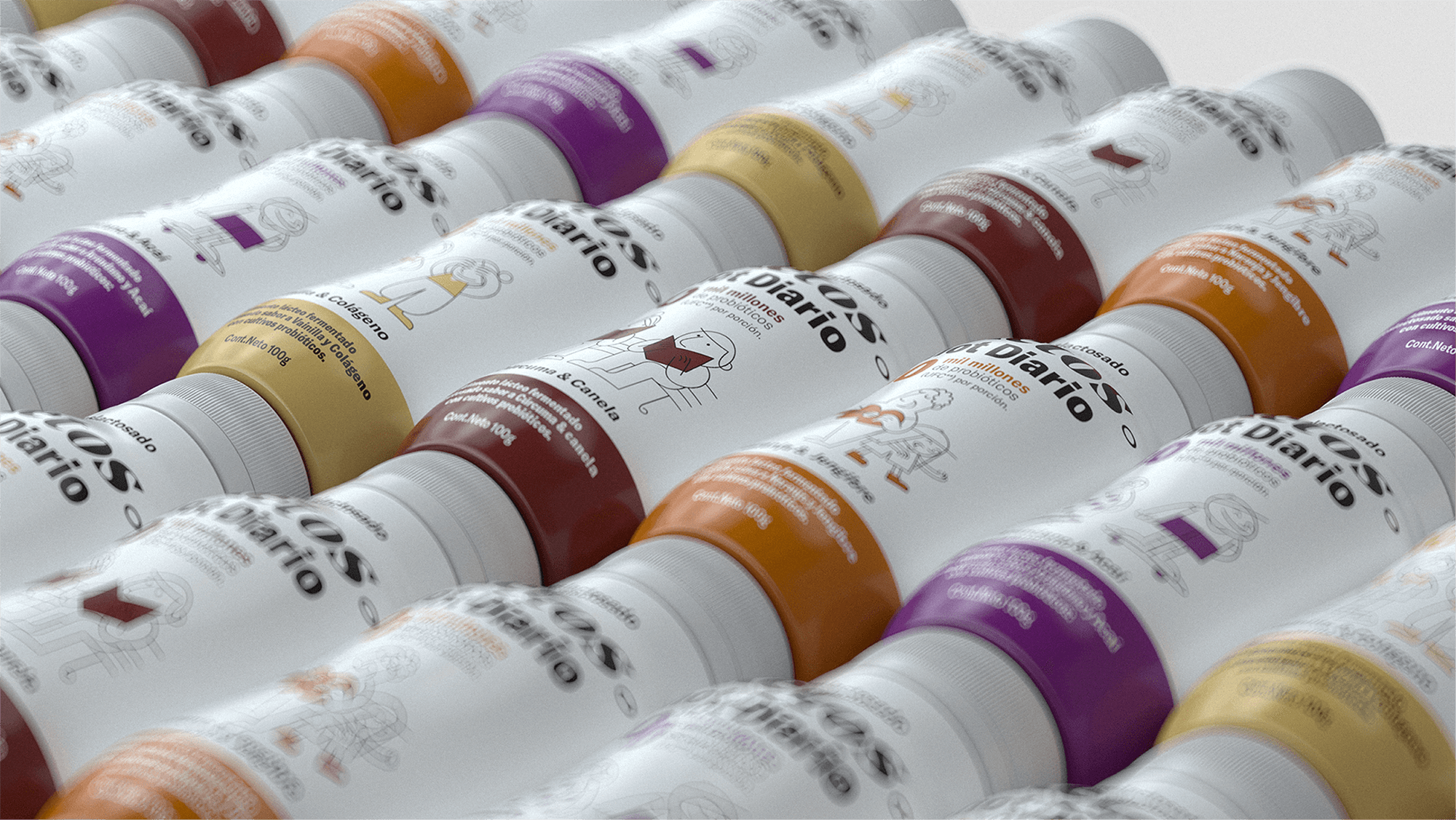
The visual system was built around a modular illustrated language representing everyday moments of personal development.
Each character follows a shared structural logic of proportion, line weight, and rhythm, allowing the visual universe to expand while maintaining unity across the packaging system.
Typography and composition are organized through a clear hierarchy and generous use of negative space, reinforcing the calm and accessible nature of the daily ritual.
Outcome
The result is a flexible packaging architecture where illustration becomes a structural brand asset.
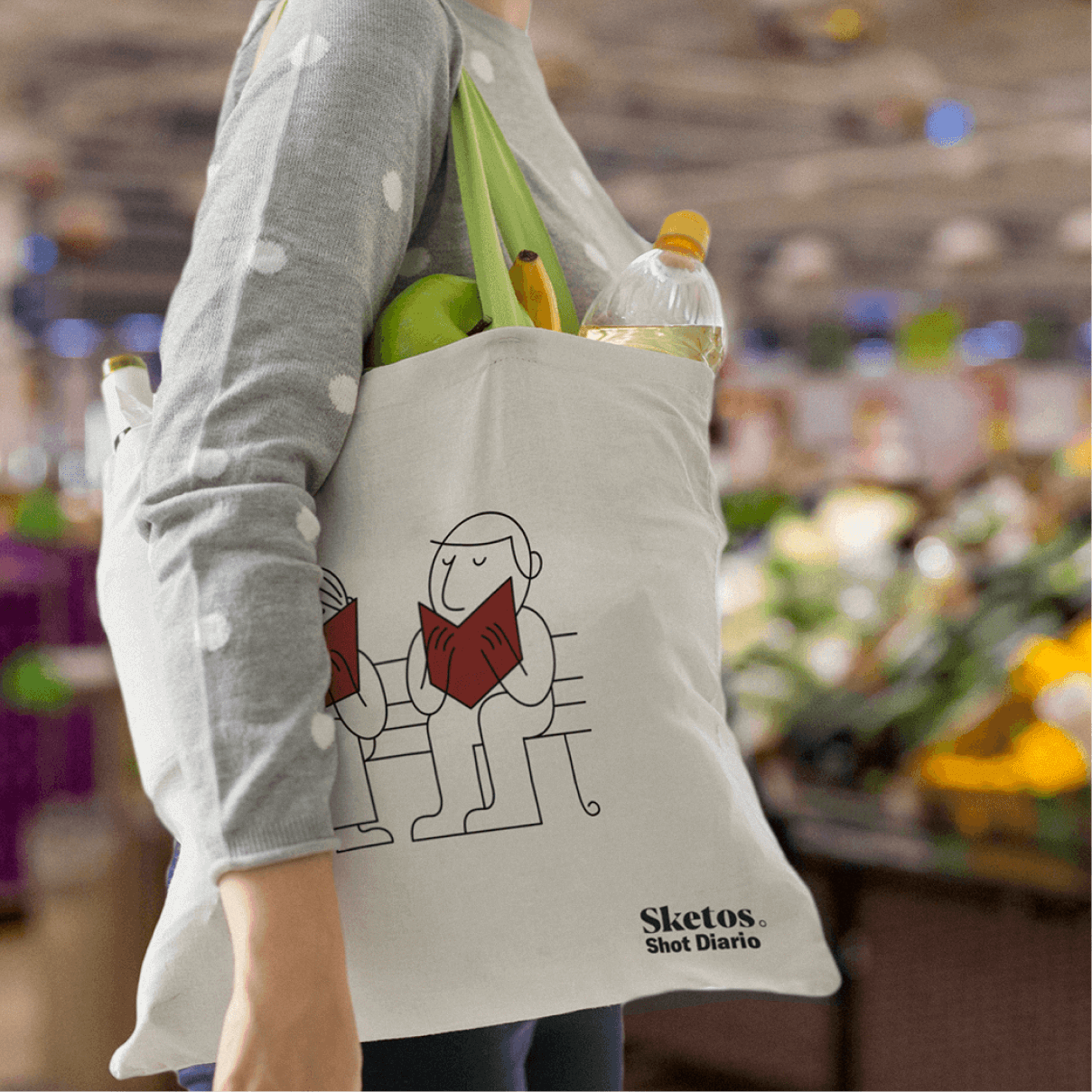
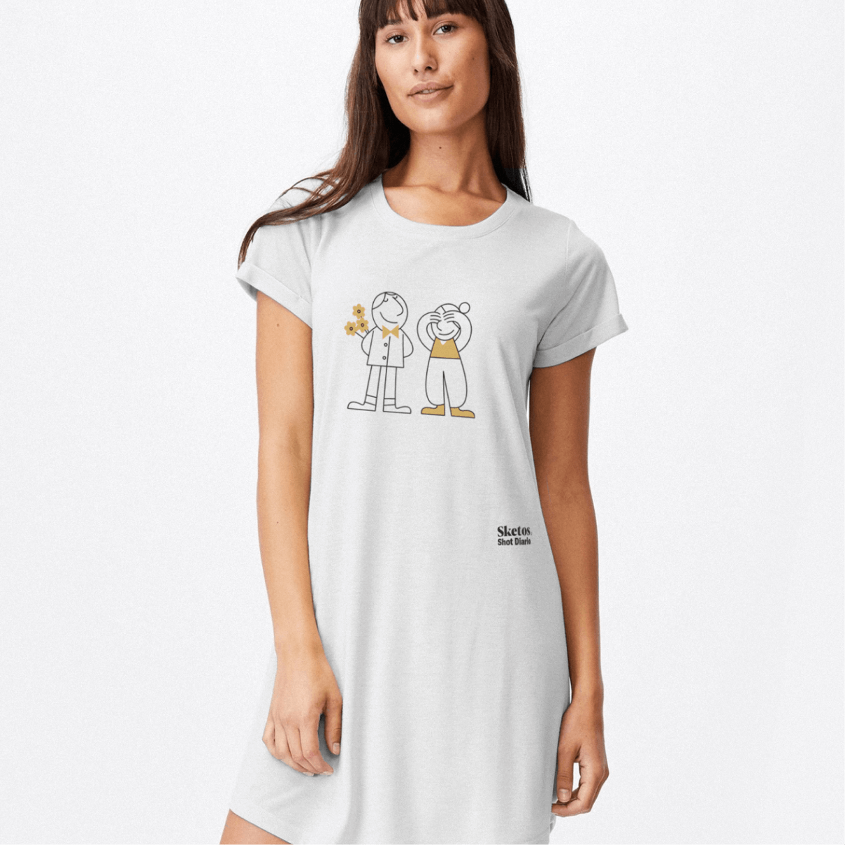
The characters function as narrative elements capable of expressing different moments of self-care while maintaining a recognizable and cohesive visual identity.
Sketos positions personal development as a practice expressed through everyday gestures and routines.